
LiveView 0.18 Released
Posted on September 21st, 2022 by Chris McCord
We’ve been working on some game-changing features for LiveView 0.18.0. Declarative assigns and slots provide compile-time warnings and enhanced docs that make building out your own UI or consuming UI libraries such a pleasant experience. These new features take function components to the next level to provide a truly first-class composable component system.
Additionally, new out-of-the-box focus components and JS commands provide accessibility improvements to ensure LiveView applications work well for all users. We also shipped a new mix formatter plugin for formatting HEEx templates, which is something you can’t live without after using it.
To understand why these features are a such a big deal, let’s take a look at a simple function component. Let’s say we have a modal component in our application and we want to call it. Prior to function components, you would write your Elixir template like this:
<div>
  <%= modal(title: "Your file is ready!") do %>
    The file will only be available for 10 minutes
  <% end %>
</div>
This is simple enough, but the issue comes when we want to place arbitrary content inside our modal title, such as a link to the download. We end up trying to concat raw HTML string together and it’s a nonstarter:
<div>
  <%= modal(title: "Your #{"<a href=\"#{@url}\" download>file</a>"} is ready!") do %>
    The file will only be available for 10 minutes
  <% end %>
</div>
This fails because Phoenix performs HTML escaping on strings, so we’d need to carefully unpack our own HTML input. The standard template model breaks down in terms of composability. Function components and slots solve this issue by allowing components to declare named slots where the caller can provide arbitrary content to named sections such as a modal title, header, or footer. Let’s rewrite the above with a function component and slot:
<div>
  <.modal>
    <:title>
      Your <.link href={@url} download>file</.link> is ready!
    </:title>
    The file will only be available for 10 minutes
  </.modal>
</div>
Now we can start to see the real power of function components and slots. Function components compose nicely within markup, and slots allow the caller to provide their own arbitrary structure, like the <:title> slot above. Here we are passing our own markup content, including calls to other function components! This allows encapsulated UI building blocks that compose together. No more arbitrary string concatenation or bespoke strict templates for each and every usecase.
Slots provide even more powerful composition. Instead of placing a single named thing in a component, slots are collections, which allows the caller to provide an arbitrary number of slot entries to a component. For example, imagine a table component where the caller needs to provide an arbitrary number of table columns. This is impossible to compose cleanly with common static HTML template abstractions, but with slots it’s beautiful to read and write:
<.table id="files" rows={@files}>
  <:col :let={file} label="Name"><%= file.name %></:col>
  <:col :let={file} label="Size"><%= file.size %></:col>
  <:action :let={file}>
    <.link patch={~p"/files/#{file}/edit"}>Edit</.link>
  </:action>
  <:action :let={file}>
    <.link phx-click={JS.push("delete", value: %{id: file.id})} data-confirm="Are you sure?">
      Delete
    </.link>
  </:action>
</.table>
Rather than writing raw <table> tags everywhere or bespoke functions like <%= file_table(rows: @files)>, we can leverage slots to define a single <.table> function component in our application which accepts a <:col> and <:action> slot. Notice how we passed multiple columns and actions above? This is a beautiful feature of slots. Internally the table can render the <thead> and <th> entries based on each <:col> label we provided. Next, to render each row, the component simply iterates over each of the rows we passed and renders a column and inner content based on each of our <:col>‘s. This makes writing markup far more pleasant and reusable compared to writing raw HTML and copy pasting styles and tags around. You’ll find once you have a core set of UI components established in your application, you rarely need to extend them with new features because of component and slot composition.
This is all looking really nice, but with more attributes and slots that are added over time, how do we discover what’s actually supported? How confident can we be with consuming such components? Enter declarative assigns and slots, where the compiler has your back.
Declarative Assigns and Slots
Thanks to Marlus Saraiva’s work trailblazing these features in the Surface library, and then contributing them to LiveView, components have now been taken to the next-level of usability and productivity.
To see how, let’s head back over to our modal. Let’s say we way to automatically show the modal when it is rendered on page load vs programmatically showing it later. Assuming someone on the team decently documented the function, we could go spelunking and maybe find an example with the show attribute to auto-show the modal. But even the best documentation can’t save us from typos or incorrect attributes or slots. For example, imagine we incorrectly pass <.modal autoshow>:
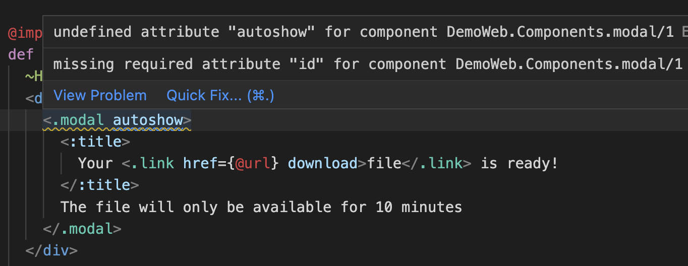
Fortunately, the compiler has our back! Here we see that our autoshow is an unknown attribute, and we learn we left off the required id attribute. We get this feedback in real-time in our editor rather than waiting for an error to pop up at runtime.
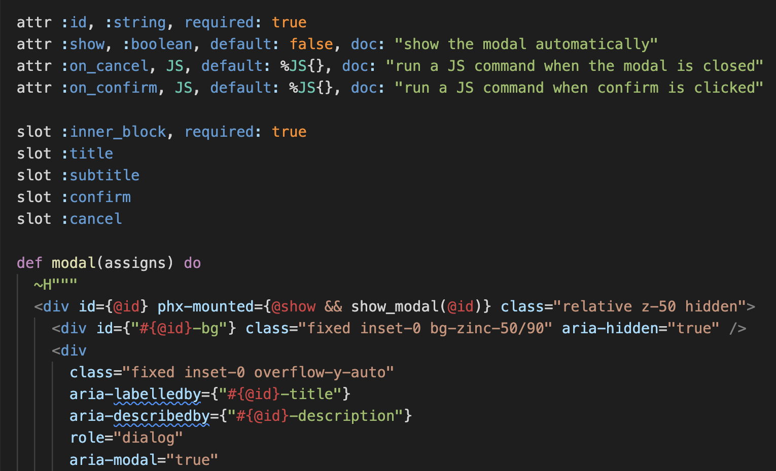
With declarative assigns and slots, function components specify the attributes, types, and slots they accept along with inline documentation. This not only provides enhanced docs, but each call of the component will be compile-time verified to provide feedback. No more runtime footguns or guesswork. This also allows the community to release first-class UI libraries where users can hit the ground running while building out their applications. Here’s what it looks like in practice:
HEEx HTML Formatter
Thanks to fantastic work by Feelipe Renan, your .heex files and any ~H template in the app will now be HTML formatted when running mix format. This is especially helpful because your markup and function components have embedded Elixir expressions, and you want those expressions formatted with regular rules like any other Elixir code. The HEEx formatter handles all those cases – formatting generic markup, formatting Elixir expressions within tags, and formatting your Elixir expressions within EEx content <%= %>. The formatter also makes sure both front-end and backend developers follow a unified coding guideline across their applications.
Let’s see it in action:
Accessibility
LiveView should be a fantastic web experience for all users, including those with accessibility needs such as screen reader users. LiveView 0.18 includes a few primitives to help on this front, with more coming soon.
First, we shipped a new <.focus_wrap> component that allows you to simply wrap any template content in <.focus_wrap>...</.focus_wrap> to have tab focus wrap back around the element. This may not sound exciting, but for screen reader users navigating with the keyboard, it is an essential primitive when displaying dialogs and modals. It’s also a feature that otherwise requires developer intervention with custom JavaScript. Let’s see it in action:
We also shipped new JS commands for handling focus states, including JS.focus and JS.focus_first. Both allow you to programmatically set the focus on an element, but JS.focus_first is especially nice as a set-and-forget command that does the right thing from an accessibility perspective. It simply finds the first focusable element within a container and sets focus there, without you having to think about it. For example, when popping a modal, you don’t need to consider if the modal has form inputs in one case, or only confirm/cancel buttons in another. Simply use the command to find the first thing to focus on and LiveView will place focus there.
Your show modal function might look something like this:
def show_modal(js \\ %JS{}, id) when is_binary(id) do
  js
  |> JS.show(to: "##{id}")
  |> JS.show(to: "##{id}-bg")
  |> show("##{id}-container")
  |> JS.focus_first(to: "##{id}-container")
end
Now any place that shows a modal in the app will focus within that modal. Coupled with <.focus_wrap> and the aria labels that phx.new will generate, screen readers users will have a fully accessible modal out of the box when using your application.
JS commands and hooks in dead views
JS commands are another declarative LiveView feature that allows you to manipulate the DOM on the client without a trip to the server. They are especially useful for showing modals and dropdowns, dispatching events, animating content, and toggling attributes, but so far have been a LiveView specific feature. Regular static views also share these same use-cases where folks want to show or hide content without bespoke JavaScript or brining in frameworks. LiveView 0.18 now includes support for JS commands and hooks inside content rendered outside of LiveView. This allows many of your core UI function components to be used across LiveViews or regular views, such as modals, flash messages, and dropdowns.
We are super excited about this release and the productivity improvements it brings, and we can’t wait to show off all the neat things it enables with upcoming Phoenix 1.7 applications.
Stay tuned and happy coding!
–Chris